
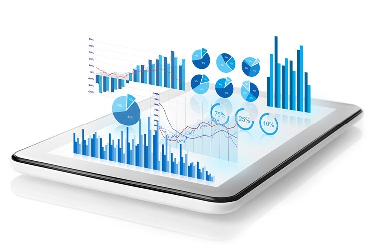
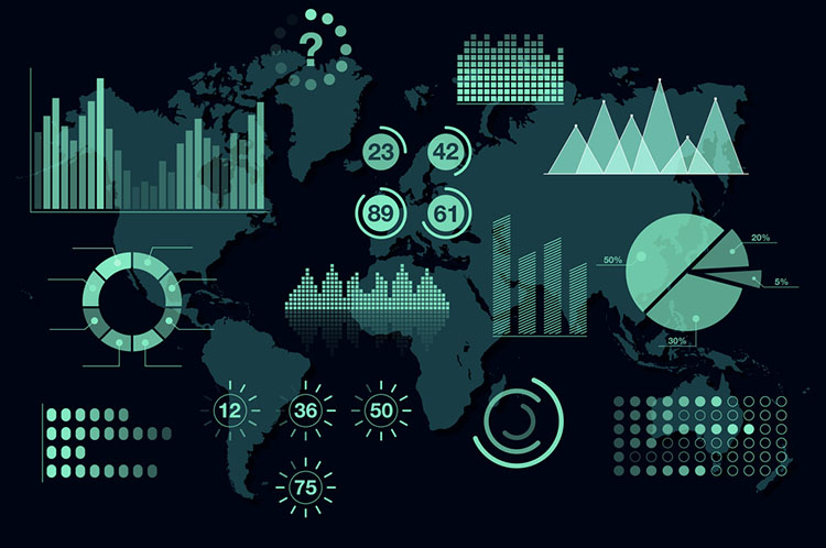
Representation of data in the graphical or pictorial format to help readers understand the information is termed as Data Visualization. This form of visual communication increases the chances of readers to gain knowledge faster. (Learn more about the best Digital Marketing Course in Noida with DIDM)
It shares information and details like statistics, trends, and correlations which are often ignored by the readers. Such information has great value and can be beneficial when analyzed carefully. Such ways make the content easily understandable, which focuses on vital information.
Over the years, data visualization has developed massively and contributed a lot to the concept of information analysis. Even in the 20th century, this technique was majorly used where people did wall drawings. The person who introduced this technique was Jacques Bertin. Later this technique gave rise to many forms with the contributions of John Turkey and Edward Tufte.
It gained enormous popularity and people are indulging in it throughout the world with the involvement of technical aspects and software. It made a tremendous impact on the world of statistics and offered a wide range of benefits to users from different domains. (Understand the concept of Digital Marketing with the Best Digital marketing course in Noida 2021)
Various Data Visualization Tools and Techniques
Focusing on the usage and application, I will mention a list of the most popular used tools and techniques in data.
Data Wrapper
Data rapper is popular in media organizations. It is one of the easiest and simplest data tools. It helps to create interactive charts by uploading CSV data. The layout is also clear and concise, which helps the reader to understand the data easily.
Tableau
Tableau makes it easily understandable when extracting information from data. For this reason, it makes Tableau popular data visualization tools used throughout the world. It creates visualizations using a dashboard and workbooks. With Tableau, you can understand the presented data easily. This is a must business data tool to have.
Fusion Charts
Developers use Fusion Charts as it allows them to simplify the complex data to make the most out of it. It offers JavaScript charts which include about 95+ varieties and 1500 maps for web and mobile apps.
Top Benefits of Data Visualization Tools
- Quick Access to Business Insights
- A better comprehension of data
- Can use data to depict a story effectively
- Helps the audience gain the required information faster and better
- A great way for visual learners
- Customized Data-Visualization
- Increases in productivity and sales
- It helps to understand better the relationship between performance and operations
- Tools make it faster to process when compared to a text form of data
- Does not miss out on information data
- Helps in identifying patterns and trends
- It provides insights on accurate Customer Behavior Analysis
- It can maintain Growth in business
With the implementation of Machine Learning and artificial intelligence, data visualization is entering a new era. It is because it helps process and perceives data easily. For this quality, it is adopted by all kinds of businesses. (Be a best Digital Marketing Professional with the Best Digital Marketing Course)
To have a firm hold on the market is essential. With data visualization, a business can keep a track of the marketing trends, customer behavior, and attracts profits.
Read More: Top 6 Youtube Channels For Data Science Learning To Follow In 2020